Custom widgets are a basic term of creating reusable widgets in flutter. Here reusable widgets means defining widgets as per our need with customization to inbuild widgets and make a new widget. We can customize all the data including Style, width, height, text etc. So in today's tutorial we will make a standalone class in flutter in lib folder and make custom widget and call the widget in our main screen.
Flutter Create Custom Class Widget with Parameter
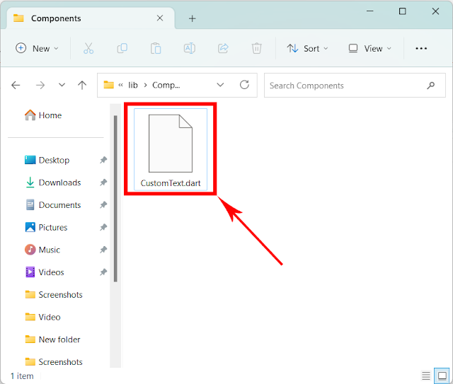
1. Create a folder Components in the lib folder of flutter project.
2. Creating a Dart file CustomText.dart in the components folder. This is our custom Text widget class file.
3. Copy Below code into CustomText.dart widget file.
Explanation:
- text argument is required and we must have to pass Text when we call this widget.
- textAlignment is non required with default value given. If use does not pass alignment value then it will call the default value which is TextAlign.start .
- textStyle is also non required value with default Text style defined.
import 'package:flutter/material.dart';

class CustomText extends StatelessWidget {
  String text;
  TextAlign? textAlignment = TextAlign.start;
  TextStyle? textStyle = const TextStyle(color: Colors.green, fontSize: 24);

  CustomText(
      {super.key, required this.text, this.textAlignment, this.textStyle});

  @override
  Widget build(BuildContext context) {
    return Text(
      text,
      style: textStyle,
      textAlign: textAlignment,
    );
  }
}
4. Importing CustomText.dart file into our main.dart file.
import 'package:flutter/material.dart';
import 'Components/CustomText.dart';
5. Creating 2 Custom Styles.
 static const TextStyle redHeading =
      TextStyle(color: Colors.red, fontSize: 28, fontWeight: FontWeight.bold);

  static const TextStyle greenHeading =
      TextStyle(color: Colors.green, fontSize: 30, fontWeight: FontWeight.bold);
6. Calling CustomText widget in Column widget and pass custom styling on it.
Column(
      children: [
        CustomText(
          text:
              'Lorem Ipsum is simply dummy text of the printing and typesetting industry.',
          textAlignment: TextAlign.center,
          textStyle: redHeading,
        ),
        CustomText(
          text:
              'Lorem Ipsum is simply dummy text of the printing and typesetting industry.',
          // textAlignment: TextAlign.center,
          textStyle: greenHeading,
        ),
      ],
    )
Source code for main.dart file:
import 'package:flutter/material.dart';
import 'Components/CustomText.dart';

void main() => runApp(App());

class App extends StatelessWidget {
  static const TextStyle redHeading =
      TextStyle(color: Colors.red, fontSize: 28, fontWeight: FontWeight.bold);

  static const TextStyle greenHeading =
      TextStyle(color: Colors.green, fontSize: 30, fontWeight: FontWeight.bold);

  @override
  Widget build(BuildContext context) {
    return MaterialApp(
        home: Scaffold(
            body: SafeArea(
                child: Center(
                    child: Column(
      children: [
        CustomText(
          text:
              'Lorem Ipsum is simply dummy text of the printing and typesetting industry.',
          textAlignment: TextAlign.center,
          textStyle: redHeading,
        ),
        CustomText(
          text:
              'Lorem Ipsum is simply dummy text of the printing and typesetting industry.',
          // textAlignment: TextAlign.center,
          textStyle: greenHeading,
        ),
      ],
    )))));
  }
}
Screenshot:


Comments
Post a Comment